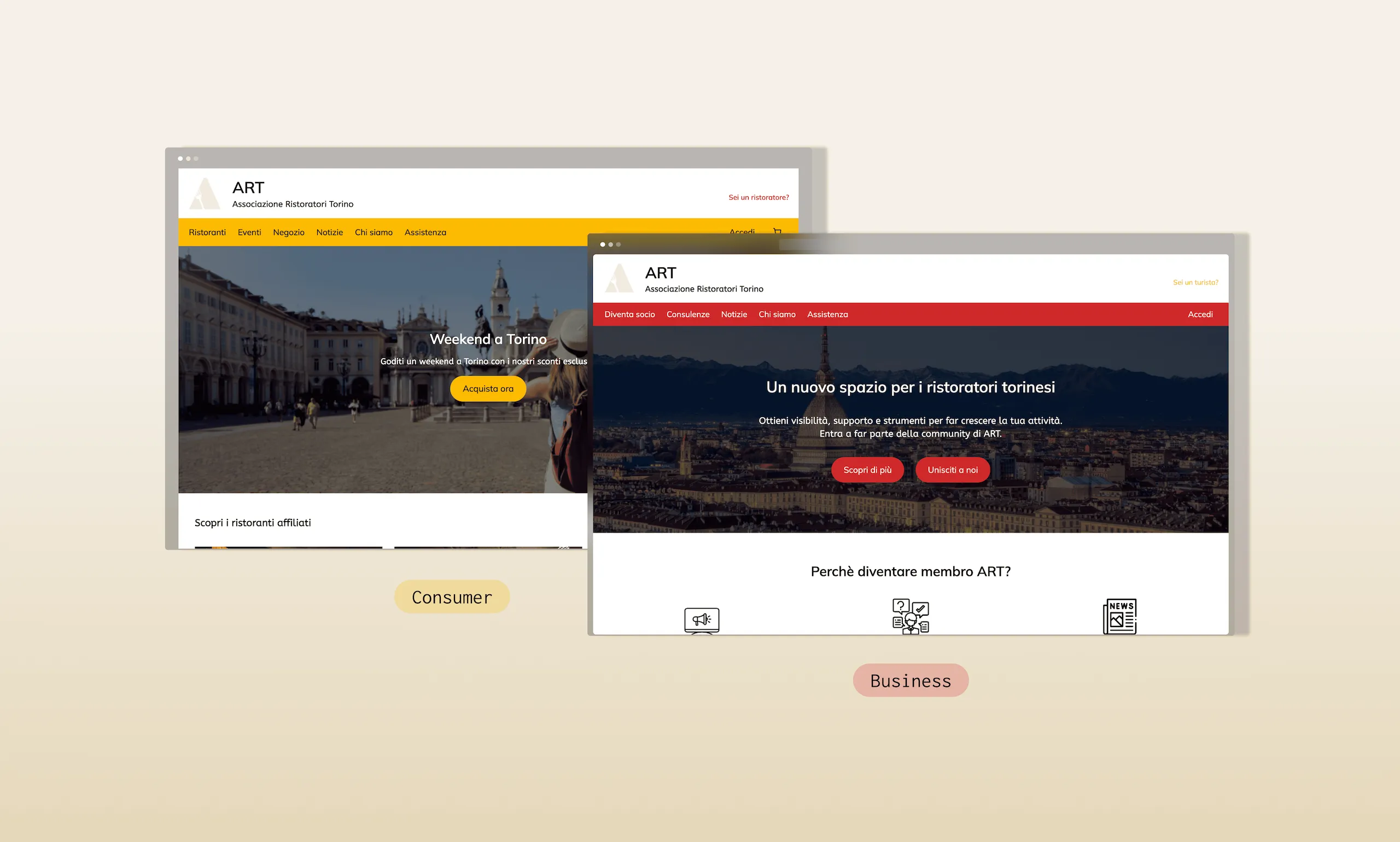
Accessibility Audit · WCAG 2.1 · GDPR Compliance · UI Restyling
Waste Manager
Accessibility strategy.
Turning a compliance problem into a product quality opportunity, from a broken accessibility audit to a WCAG 2.1 AA restyling and a full GDPR gap analysis.
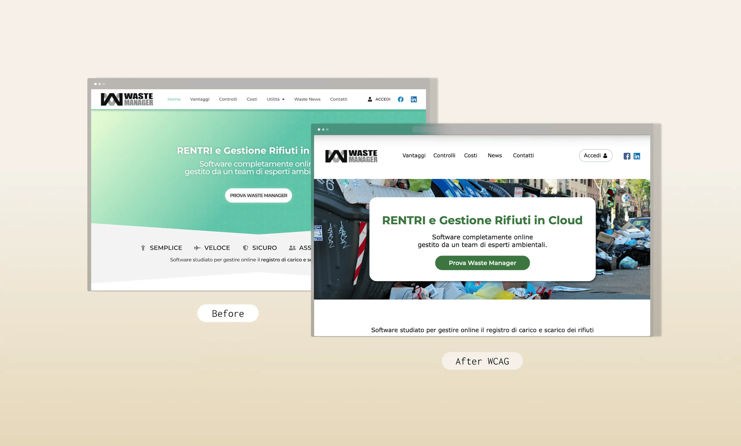
Snapshot
Role
UX Designer — Solo
Duration
2 weeks
Platform
Web — B2B SaaS
Tools
Figma · Accessiway · WCAG 2.1 guidelines
Key outcome
18 accessibility fixes · 6 GDPR priority actions identified
Year
2025
The brief in one sentence
"Audit Waste Manager's existing website for accessibility and GDPR compliance, then redesign it — without losing the existing brand — to meet WCAG 2.1 AA standards."
The Problem
Waste Manager's website had never been designed with accessibility in mind. For a B2B SaaS selling to public administrations (municipalities, councils) that's both a UX problem and a legal exposure.
Public sector clients in Italy are subject to accessibility requirements under the Legge Stanca (L.4/2004) and the EU Web Accessibility Directive. A supplier whose own website fails basic WCAG checks sends a contradictory signal to exactly the clients it's trying to win. Beyond the legal risk, the existing site was excluding a real share of potential users — low-vision users, screen reader users, anyone navigating by keyboard alone.
Problem statement
How might we make Waste Manager's website accessible to all users — including those relying on assistive technologies — while keeping the existing brand identity and meeting GDPR requirements?
Accessibility Audit — what was broken and why it mattered
Before redesigning anything, I audited the existing site systematically against WCAG 2.1 criteria, finding 6 categories of failures that affected users across the full spectrum of disability types.
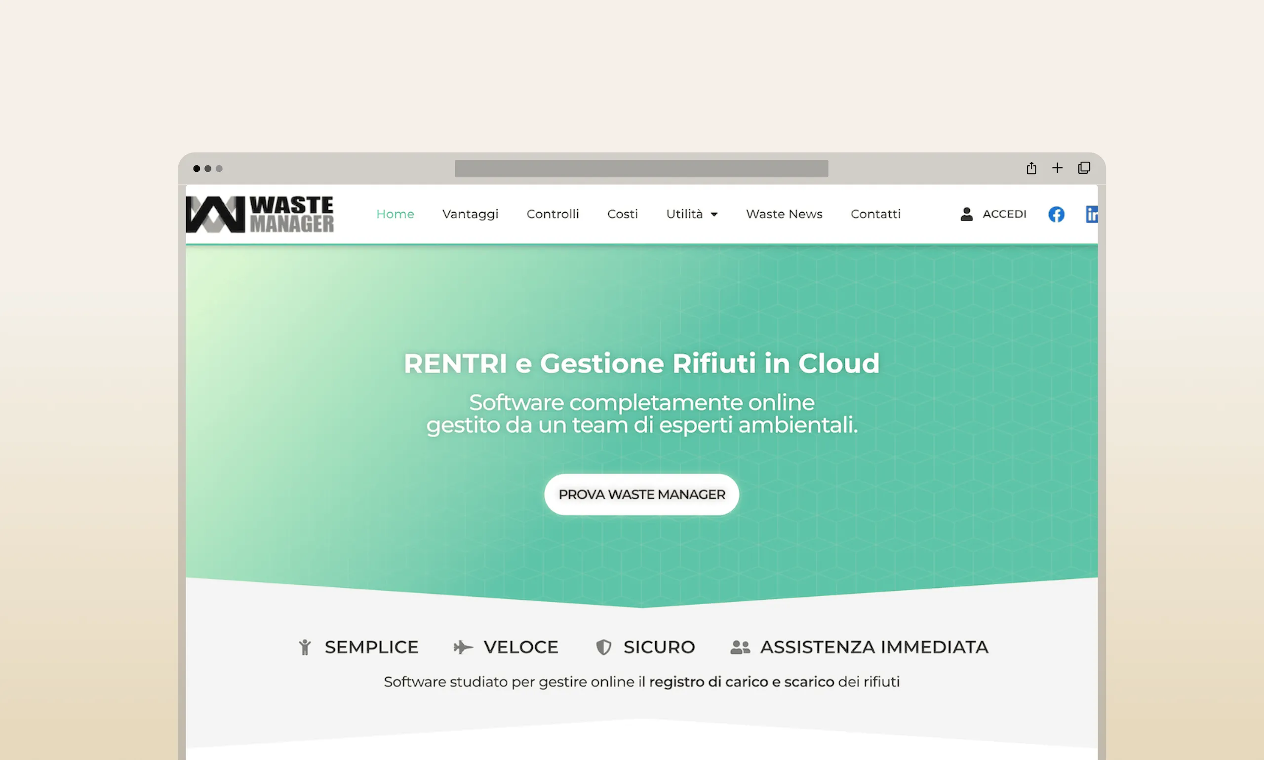
The original website, before the restyling.
Finding 01
Low contrast text
Text and background combinations below the 4.5:1 minimum ratio. Users with low vision, colour blindness, or reading difficulties cannot reliably read the content.
WCAG 1.4.3 — Contrast (Minimum)Finding 02
Images without alt text
Decorative and informative images lack alternative text. Screen reader users receive no information about visual content — entire sections of the page are invisible to them.
WCAG 1.1.1 — Non-text ContentFinding 03
Form fields without labels
Input fields have no programmatic labels. A screen reader user cannot determine what information is required in each field — the contact form is effectively unusable.
WCAG 1.3.1 — Info and RelationshipsFinding 04
Inaccessible multimedia
Video and audio content has no captions, transcripts, or audio descriptions. Users with hearing or visual impairments cannot access time-based media content.
WCAG 1.2.1 — Audio-only and Video-onlyFinding 05
Unstructured headings
Heading levels (h1–h6) are used for visual styling rather than semantic structure. Screen reader users cannot build a mental map of the page or navigate by heading.
WCAG 1.3.1 — Info and RelationshipsFinding 06
Non-descriptive link text
"Click here", "read more", "link" generic anchor text that gives no information about the destination. Screen reader users navigating by links alone cannot determine where each link leads.
WCAG 2.4.4 — Link PurposeRestyling: 18 fixes, 8 decisions, one principle
Every design decision in the restyling addressed a WCAG violation, most tracing back directly to the 6 findings above, a few surfacing only once I started rebuilding the interface and testing it with a keyboard. Below are the 18 individual fixes, organized into 8 decision areas.
The green from the existing logo was kept but darkened to achieve the minimum contrast ratio. On typography: Montserrat for headings and buttons (brand-compatible), Verdana for body text, chosen because Accessiway research identifies it as one of the most accessible web fonts due to its wide letterforms and generous x-height.
Before
Insufficient text contrast
No alt text on images
Form fields without labels
Headings used for styling only
After
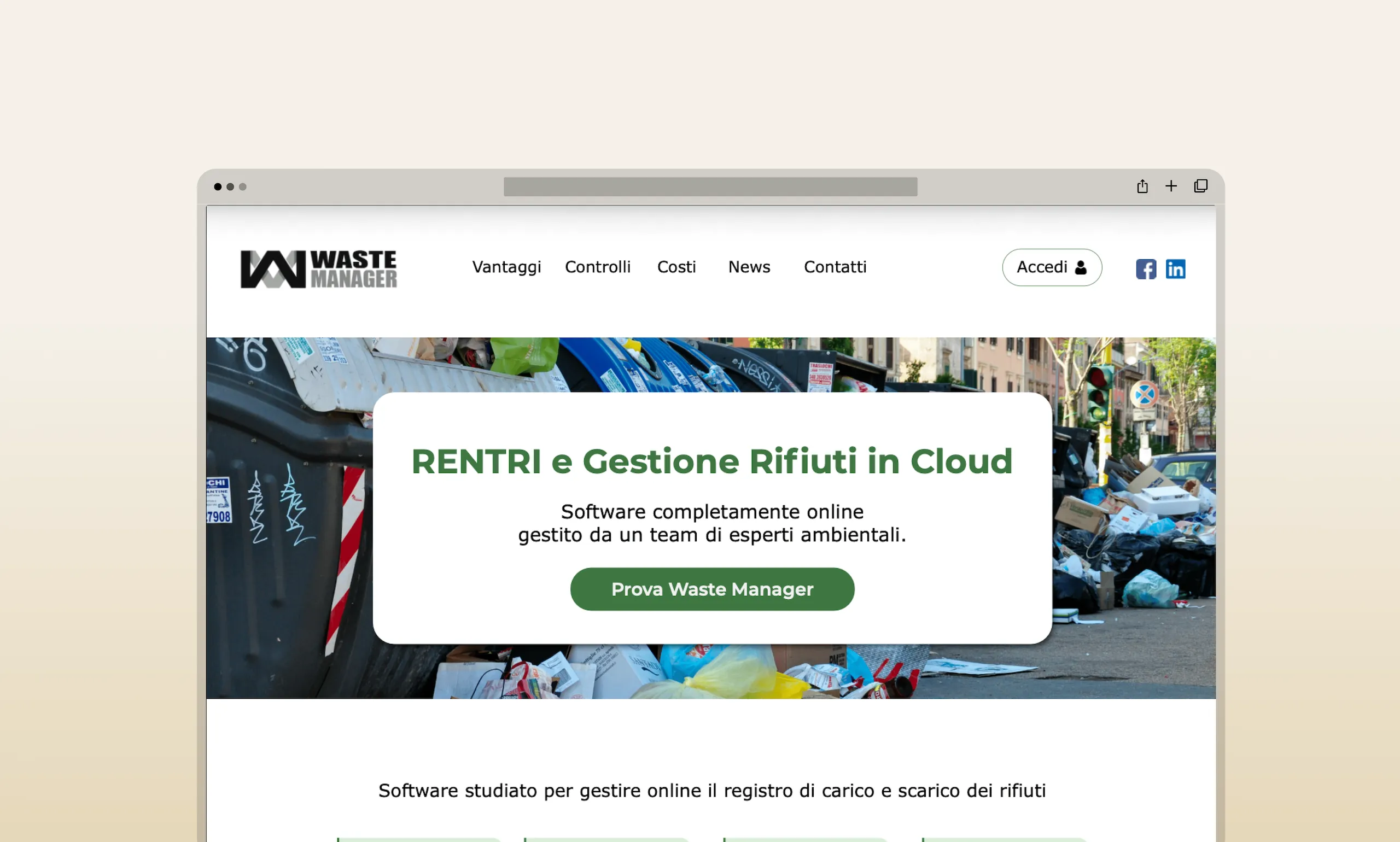
Darkened green — contrast 4.38:1 → 9.38:1
Alt text on every informative image
A label on every form field
Semantically correct h1/h2/h3 structure
Contrast and accessible typography
Darkened the brand green to achieve a contrast ratio above the 4.5:1 minimum for normal text. Font sizes set to minimum 16px. Line height and letter spacing optimised for readability. Montserrat (headings) + Verdana (body) — both sans-serif, both verified against accessibility research.
Homepage · All pagesSemantic heading structure
Rebuilt heading hierarchy from scratch: one h1 per page, h2 for sections, h3 for subsections. Headings describe content, not visual style. Screen reader users can now navigate the page by jumping between headings — a fundamental interaction that was previously impossible.
All pagesIcons with alt text and visual hierarchy
Added icons to the Vantaggi page to reduce reading load and reinforce meaning. Every icon has an alt text that describes its meaning (not "icon" — the actual concept it represents). Images used to break up text-heavy sections, each with descriptive alt text.
Vantaggi pageKeyboard navigation with visible focus
All interactive elements reachable by Tab key in logical order (tabindex). Custom focus styles added — the default browser focus ring was either invisible or removed by the previous CSS. Users navigating without a mouse can now see exactly where they are on the page at all times.
Vantaggi page · All interactive elementsSemantic structure and ARIA landmarks
Explicit header, footer, nav, main elements defined. ARIA landmark roles added (role="banner", role="navigation", role="main", role="contentinfo"). Screen reader users can now jump directly to the main content, skipping navigation — an interaction that WCAG requires but the original site made impossible.
Controlli page · All pagesNo unexpected context changes
Removed all timed pop-ups and short-duration elements. Everything on the page is predictable: nothing opens automatically, nothing disappears before the user has finished reading. This is critical for users with cognitive disabilities and for anyone using a screen magnifier or switch access device.
Costi page · All pagesAccessible multimedia with controls
Audio player added to the News page for users with visual impairments. Controls include play, pause, rewind, speed adjustment. Subtitles and transcripts provided for all time-based content. The lang attribute set on the HTML element so screen readers use the correct language engine.
News pageLabelled forms and descriptive links
Every form field has a programmatic label associated via the for/id pattern. "Leggi tutto" links now include the article title for screen readers (visually hidden text). Social media links have ARIA-labels ("Visita la nostra pagina Facebook"). Broken links removed across all pages.
Contatti page · News pageGDPR Analysis: a separate but equally urgent problem
Alongside the accessibility audit, I reviewed the Privacy Policy and Cookie Policy against GDPR requirements, and found a separate set of gaps that put the company at legal risk.
For a B2B SaaS operating in the public sector, GDPR compliance isn't optional. Municipalities and public bodies are required to verify that their suppliers handle data correctly, so a non-compliant privacy policy isn't just a legal risk — it's a sales obstacle.
Both documents had real gaps, and a few of them echoed the accessibility findings rather than sitting apart from them: the cookie banner was technically present but visually inaccessible, which makes consent invalid on both fronts at once. The Privacy Policy didn't declare what personal data the company actually collects or explain how to withdraw consent, and the Cookie Policy listed several cookies as "purpose under investigation," with no legal basis or retention duration attached to any of them. Some fundamentals were already solid — the data controller was identified, retention periods were specified, cookie categories were clearly defined — but the gaps above were specific enough to act on right away. I'm not a lawyer, so I kept this analysis at the level of flagging the issues and handed the following checklist to the client's legal team for review.
Priority action checklist
Impact
The restyling moved the site from failing 6 WCAG categories to full compliance, with contrast ratios more than doubled and user interactions redesigned to work with assistive technology.
4.38→
9.38:1
Contrast ratio improvement: from below AA minimum to above AAA threshold
18
Accessibility improvements across 6 pages: contrast, alt text, labels, keyboard nav, ARIA, multimedia
6
Priority GDPR actions identified with a concrete remediation checklist ready for legal review
Reflections
This project changed how I approach every design decision, because fixing these accessibility issues made the site better for everyone who uses it.
- The most impactful change was the contrast ratio: a single colour decision that cost nothing to implement and immediately made the site readable for millions of users with low vision. Good accessibility is often just good design with the right constraints applied early.
- The GDPR analysis revealed something I didn't expect: the legal and the UX problems were the same problem. A cookie banner that's visually inaccessible isn't just a WCAG failure, it's also invalid consent under GDPR, because users who can't see it can't meaningfully accept or reject it.
- What I would do differently: I would have tested the restyled prototype with actual assistive technology users rather than relying solely on automated audit tools and manual review. Tools catch structural issues; only real users reveal whether the experience actually works.