Information Architecture · RBAC · E-commerce Development
ART
Role-based membership platform.
Designing a dual-audience platform for Associazione Ristoratori Torino: one website, two completely separate experiences, a membership system built on role-based access control.
Snapshot
Role
Product Designer
Designed and built the entire membership experience: access logic, technical implementation and troubleshooting.
Team
Team of 3.
Collaborated with the team on early research, sitemap, and wireframes.
Duration
3 weeks
Tools
Figma · WordPress · Stripe · WooCommerce · Simple Membership
Key challenge
Two opposing user types, one coherent system
Year
2025
The brief in one sentence
"ART needed a platform that sells restaurant discount packages to tourists and sells membership plans to restaurateurs: two audiences with opposite goals, sharing the same domain."
The Problem
The real challenge was designing a navigation system that doesn't confuse a tourist looking for a weekend deal with a restaurateur trying to manage their membership, without forcing either to wade through content meant for the other.
A single navigation or homepage would have created cognitive overload and a broken conversion funnel for both targets. Tourists don't need to know about membership tiers. Restaurateurs don't need to see weekend deals. The IA had to make the split invisible while keeping the whole system navigable from either side.
Problem statement
How might we serve two audiences with conflicting needs on the same platform without making either feel like they've landed in the wrong place?
Two targets, two mental models
Before touching the IA, we mapped what each user actually needed to do, and how different those jobs were.
Weekend visitor to Turin
Arrives from Google or a friend's recommendation. Wants to browse restaurants, buy a discount package, get in and out fast. Has zero interest in ART as an organization.
Browse affiliated restaurants by type or area
Purchase a "Weekend Sapori Torino" package
Complete checkout without creating an account first
Find events and book a table
Turin restaurant owner
Arrives with a specific goal: join ART, get visibility, access consulting services. Evaluates membership tiers on cost versus benefit. Needs to upload restaurant data and manage their profile after subscribing.
Compare membership tiers (Free / Base / Premium)
Subscribe and pay securely via Stripe
Upload restaurant data to generate their public listing
Access tier-gated services (consulting for Premium only)
Information Architecture: the split that holds everything together
The IA decision that defined the entire project was treating the two audiences as two separate sites sharing one domain with a single, low-friction switch between them.
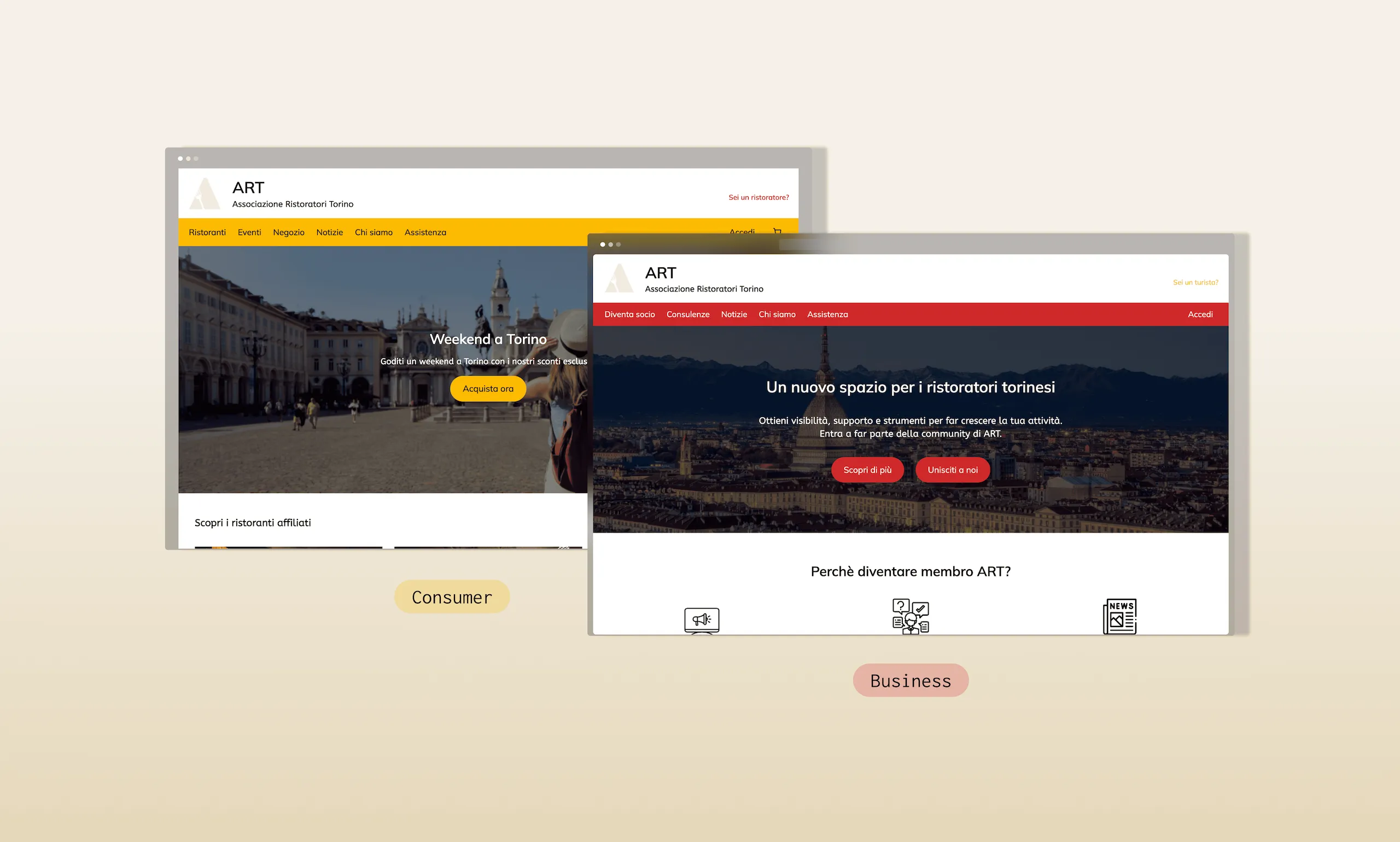
The consumer homepage is the default entry point for most visitors. Depending on the search intent, however, Google may surface either the consumer or the business homepage. Each experience includes a persistent link to the other in the top-right corner ("Sei un ristoratore?" on the consumer side and "Sei un turista?" on the business side). Once users switch, the navigation changes completely: different voice, different color (red vs yellow), and different CTA hierarchy, so the user always knows which side they're on.
Simplified sitemap — dual track structure
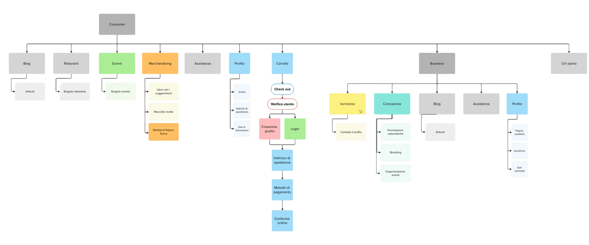
I proposed splitting the two experiences completely rather than merging them into shared navigation, and the team validated it during wireframing, iterating on the first sitemap.
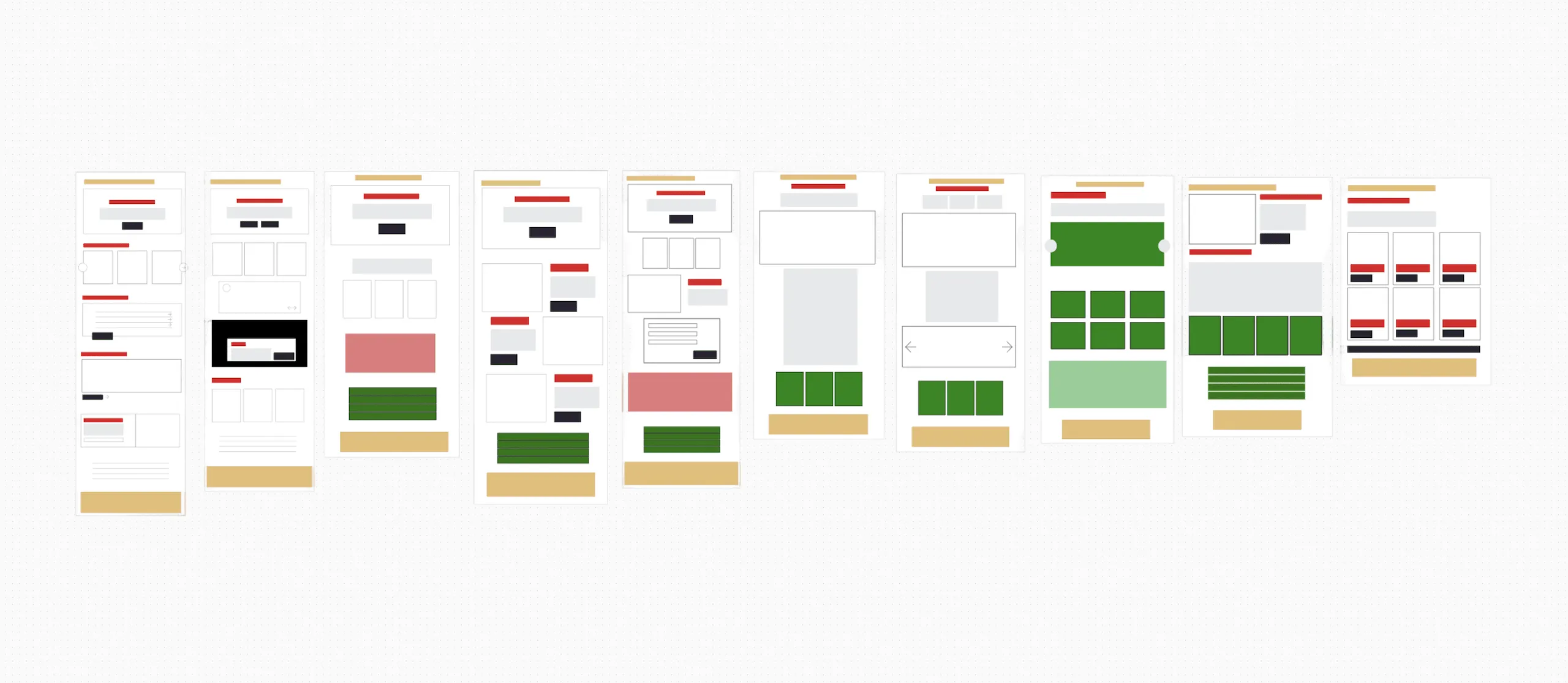
First wireframes of the 10 main screens — consumer and business tracks.
Process
We worked across three broad phases: IA and wireframes first, then UI and membership logic, then technical implementation and edge-case resolution, though in practice the last phase fed back into the first more than once.
IA mapping and dual-track wireframes
We mapped the full sitemap for both tracks, identifying shared pages (account, assistenza) and exclusive ones (diventa socio, dati ristorante, consulenze). Then we wireframed the 10 key screens: homepage consumer, homepage business, product page, membership page, checkout flow, and the account page both with and without an active membership.
Artifacts: sitemap · 10 wireframes · user flow diagramRBAC design — defining what each role can see and do
I designed the full access matrix: 5 user states (guest, registered tourist, free member, base member, premium member) against every gated feature. Key decision: consulting forms accessible to Premium only, restaurant data upload open to Base and Premium, and the newsletter restricted to paying members: a deliberate filter to generate qualified leads instead of spam signups.
Artifacts: access matrix · role-state diagramUI design and membership page optimization
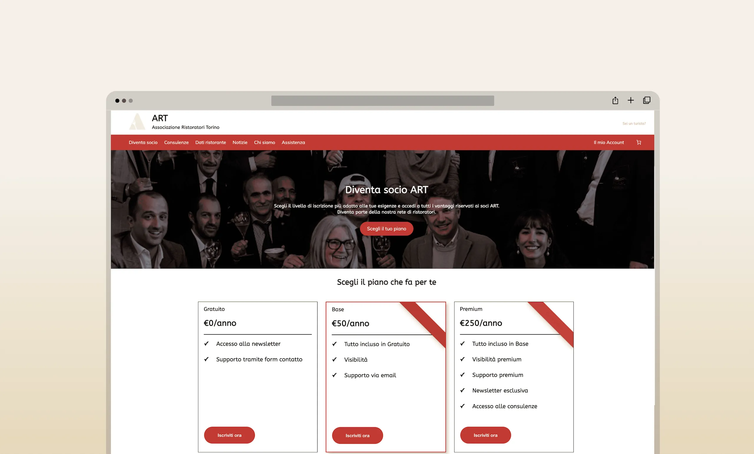
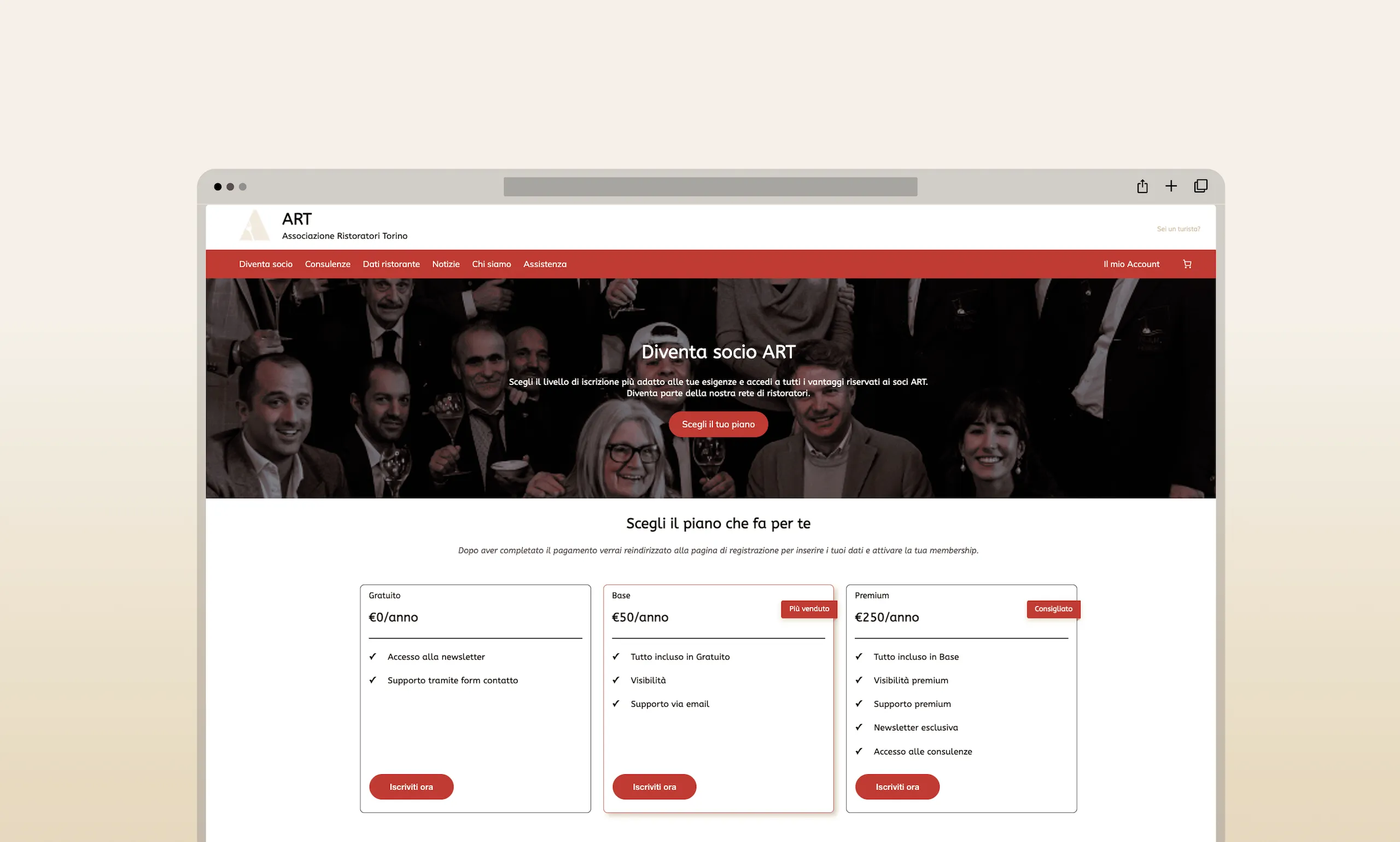
High-fidelity mockups for all key screens. For the membership page specifically: removed the extra click to see plan benefits, so all tiers are compared on a single page; added social proof through testimonials and an FAQ to cut down on support requests; and visually flagged the Base tier as "most sold": a deliberate nudge for budget-conscious small restaurants.
Artifacts: mockups · membership page before/afterBefore
After
Technical implementation and critical issue resolution
Built in WordPress with WooCommerce, Simple Membership, and Stripe. Along the way I ran into three critical technical blockers, each one meant digging through documentation, tracking down the actual root cause, and landing on a solution that wasn't obvious from the start. Details below.
Artifacts: live WordPress site · 3 documented critical resolutionsKey Decisions
Every decision on this project came down to the same tension: making the membership funnel as frictionless as possible for restaurateurs, without opening the system to unqualified or fake signups.
Decision 01 — Stripe over PayPal
Stripe as the sole payment provider
Fewer clicks to complete payment, lower commissions on European card transactions, better subscription management through the Stripe customer portal, and a cleaner integration with Simple Membership.
Why → Research showed PayPal adds 2 extra steps for users without an account — a significant drop-off risk at the most critical point of the conversion funnel.
PayPal + Stripe dual option
Offering both as payment options, the way many e-commerce sites do.
Why not → More options at checkout increase decision fatigue and abandonment. For a B2B subscription, one clear, trusted path is better than choice.
Decision 02 — Registration only after payment
No free registration — purchase or checkout to create an account
Restaurateurs select a plan, including the free tier, before an account is created. Tourists complete a purchase first. No open registration form anywhere on the site.
Why → Requiring at minimum a credit card for the free tier eliminates fake email signups and ensures newsletter subscribers are genuinely interested — a higher-quality lead database from day one.
Open registration with email verification
A standard registration form open to anyone, with email verification before unlocking any gated content.
Why not → Creates a pool of low-intent users that pollutes the member database and increases support load for no business value.
Decision 03 — Stripe customer portal for subscription management
Delegate subscription management to Stripe's hosted portal
Cancellations, upgrades, and billing updates are all handled on Stripe's side through a secure link. A "Gestisci abbonamento" button on the account page sends the user there via an email magic link.
Why → Building custom cancel/upgrade flows in WordPress would have created security risks and maintenance overhead. Stripe's portal is PCI-compliant and handles edge cases (failed payments, prorations) automatically.
Custom cancel and upgrade pages in WordPress
Building dedicated pages inside the site for every subscription management action.
Why not → Would require handling edge cases manually (failed renewals, mid-cycle upgrades, refunds) — complexity the project scope and the client's technical capability couldn't support.
Critical issues resolved — the real problem-solving
The hardest part of this project wasn't drawing the interface, it was the three technical blockers I hit during implementation, and each one turned into a UX question as much as an engineering one. A €0 product breaking Stripe's checkout wasn't just a bug to patch; it forced me to rethink what a free-tier signup should actually feel like. Here's how I worked through each one, alone.
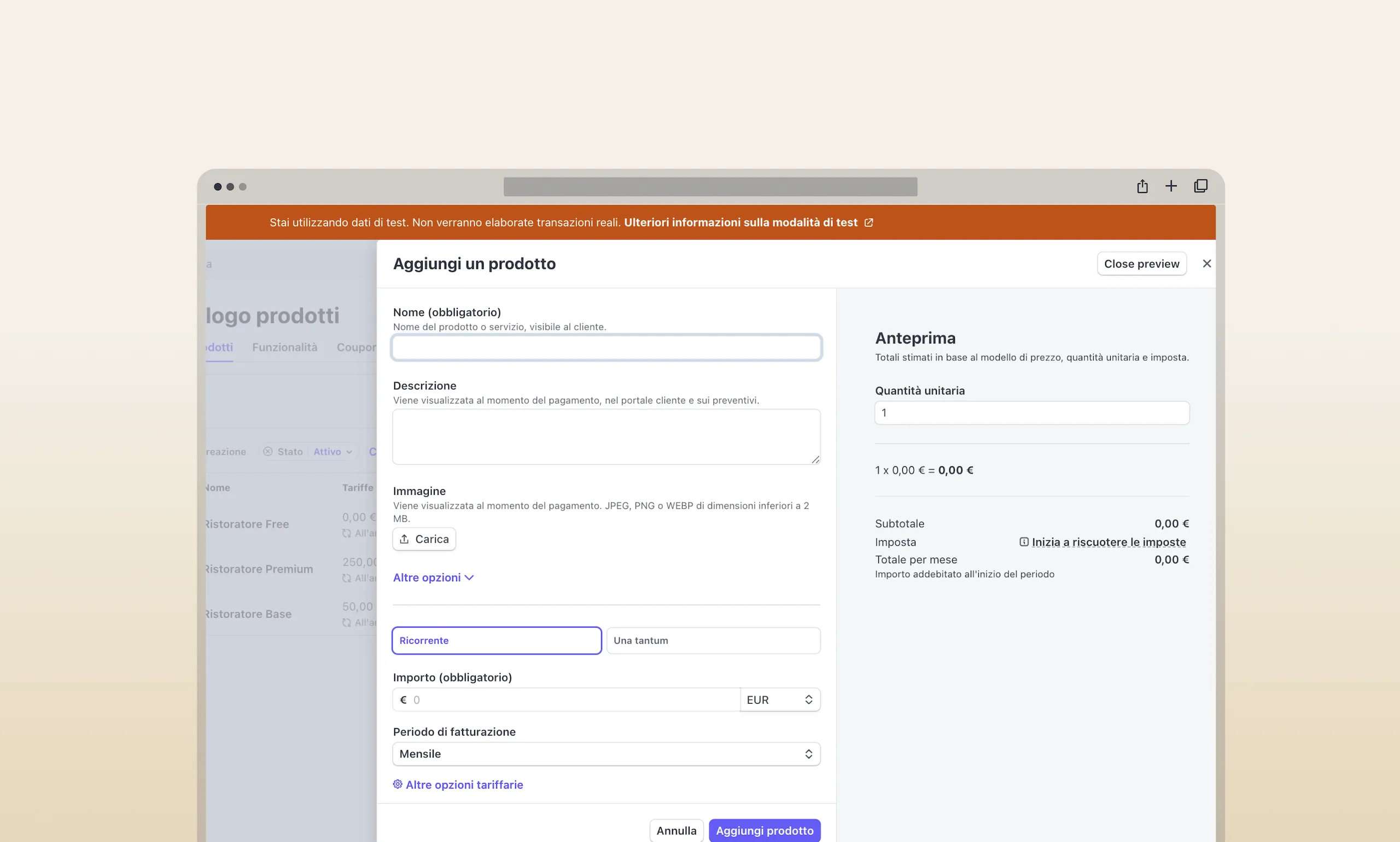
Stripe "Buy Now" can't process €0 products
Payment · Stripe APIThe problem: The free membership tier needed to go through Stripe for consistency (so the user still creates a payment profile). But the standard Stripe "Buy Now" button throws an error when the product price is €0.
How I resolved it
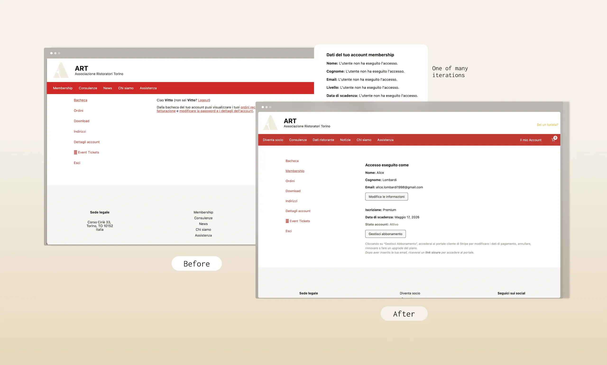
WooCommerce and Simple Membership don't share an account page
Plugin integration · PHPThe problem: WooCommerce has its own "My Account" page. Simple Membership has its own separate member area. A user who subscribes ends up with two disconnected account spaces — confusing and unbrandable.
How I resolved it
Restaurant data submission couldn't handle file uploads
Form plugin · File handlingThe problem: Base and Premium members need to submit their restaurant data (name, hours, address, photos) to appear on the consumer-facing listings. WP Forms — the first plugin I tried — doesn't support file uploads in the free tier.
How I resolved it
Impact
The project delivered a fully functional dual-audience platform, working payment flows, role-based access, and a unified account experience, completed in 3 weeks, with the membership system designed and built solo.
3
Membership tiers fully operational — Free, Base (€50/yr), Premium (€250/yr) — each with correct access gating
5
User states designed and tested — guest, registered tourist, free member, base member, premium member
3
Critical technical blockers identified, root-caused, and resolved independently, without external support.
Reflections
The most valuable part of this project was learning that reading documentation and working through technical constraints systematically is itself a design skill.
- The IA split between consumer and business tracks was the right call, but I underestimated how much the shared pages (account, assistenza) needed to adapt per role. A fully role-aware navigation, where the active user type changes which items are highlighted, would have been cleaner.
- Choosing Stripe's hosted portal for subscription management was pragmatic but creates a seam in the UX, the user leaves the site to manage billing. A next version would explore Stripe's embedded components to keep that flow on-domain.
- Documenting the technical blockers as I solved them (problem → investigation → solution → result) turned out to be more useful than I expected. It's the kind of thinking a product designer needs to demonstrate to work effectively alongside engineers, and it's now the most concrete evidence I have that I can do that.