Service Design · UX/UI · Web Development · Brand Strategy
Da Bianca
1 restaurant. 2 platforms. 3 personas.
Transforming a 45-year-old family restaurant into a coherent digital ecosystem: from zero online presence to a full omnichannel strategy, new brand identity, and working website.
Snapshot
Role
Product Designer — Solo
Duration
4 months
Platform
Web · Mobile app · Physical touchpoints
Tools
Figma · WordPress · Elementor · Adobe Suite
Deliverables
Brand identity · Website · App · Packaging · Content strategy
Year
2025
The brief in one sentence
"Da Bianca has been feeding locals and tourists since 1981, but had no website, no social presence, and no digital strategy. Design the entire ecosystem from scratch, without losing their identity."
Context — the starting point and real constraints
Da Bianca had built 45 years of reputation without ever needing to ask for it — but reputation alone doesn't reach a tourist scrolling Google from a hotel room in Munich, and restaurants with a weaker menu but a stronger digital presence were starting to win bookings Da Bianca didn't even know it was competing for.
The business situation
Despite decades of loyal local custom, 100% of bookings still came by phone. There was no online presence, no reviews strategy, no way to be found before someone was already standing outside. Meanwhile the German clientele, historically the most loyal, was shrinking, while new visitors from the Czech Republic, Poland, and France kept arriving, but leaving the next day.
Real constraints
Da Bianca is a family-run business, and the owner needed to be able to run the new system without me. That meant WordPress with free plugins wherever possible, accessibility built in from day one rather than retrofitted, and full multilingual support in Italian, English, and German from the very first page. There was no budget for custom development — every technical choice had to be solvable with tools that already existed.
The Problem — what was actually broken
Da Bianca had no coherent story being told online, no way for the right people to find them before arriving in Malcesine, and no system to keep guests connected after they left.
Two thirds of diners check reviews and a restaurant's online presence before choosing. With zero digital presence, Da Bianca was invisible to Lena planning her trip from Munich, and unreachable to Olivia and John scrolling Instagram in London. Meanwhile, the single most differentiating asset, the natural spring that provides the trout existed only in the memory of locals.
Problem statement
How might we make Da Bianca discoverable, bookable, and memorable for three very different user types without losing the human warmth that 45 years of regulars keep coming back for?
Research — who I designed for and what I found
Before opening Figma, I ran three multilingual questionnaires, analyzed 588 Google reviews, and mapped the competitive landscape from local Malcesine rivals to international best practices, like Silo London.
The clearest finding was that behaviors differed radically by nationality. 75% of German respondents wanted to pay online; 60% of Italians refused to. 94% of English-speaking respondents were happy to pay online but expected digital ordering, AR menus, and fast pickup. This wasn't one audience — it was three distinct products sharing a kitchen.
Lena
46 · German tourist · Plans ahead
Pre-plans her trip weeks in advance, checks reviews, needs translated menu, cares about sustainability and ingredient transparency. Doesn't want surprises like the coperto.
Core need → Multilingual clarity, online booking, trust signals before arriving.
Marco
38 · Local regular · Low digital trust
Finds restaurants through word of mouth, calls to book, uses Google Maps only for hours and directions, distrusts online payments. He wants the dish he knows, served by someone who knows his name.
Core need → Phone booking still available. Technology should be invisible to him.
Olivia & John
Late 20s · UK tourists · Digital-native
Discover restaurants on Instagram, want QR ordering, fast payment, photogenic food. Will share stories and leave a Google review, and they judge a restaurant by its Instagram before stepping inside.
Core need → Mobile-first experience, shareable moments, smart takeaway option.
Process — how I structured the work
For this project, I had to work at four levels simultaneously: brand, digital product, physical space, and communication strategy, so I approached it in phases, with each phase informing the next.
Research & scenario analysis
Market analysis of Italian and Veneto restaurant sector, benchmark of 8 national and international brands (from Miscusi to Silo London), competitor audit, and 3-language qualitative questionnaires with 44 respondents.
Artifacts: questionnaire results · competitive analysis · SWOTPersonas, customer journey & brand strategy
Three personas with full BAIFDASV journey maps. Simon Sinek's Golden Circle applied to define the brand "why", not "what we serve" but "the story of a family and a spring." Vision, mission, values, and value proposition for each persona.
Artifacts: 3 personas · 3 customer journeys · brand frameworkBrand identity & visual system
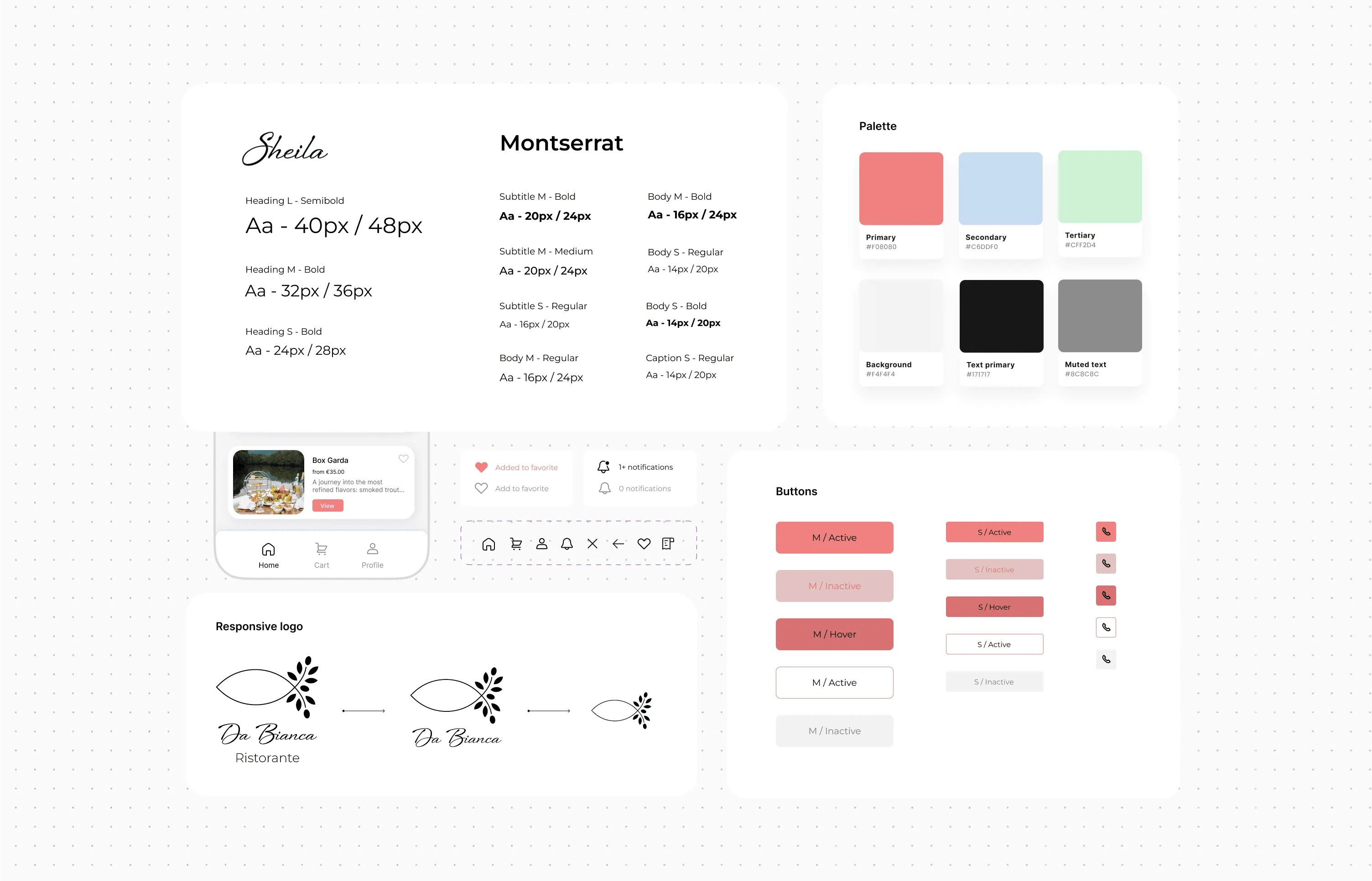
New logo combining trout (the spring's product) and olive branch (the territory of Malcesine). Responsive logo in 3 versions. Color palette derived from the landscape: blue for the spring, green for the olive tree, coral pink for the sunset over the lake and warmth. Sheila (calligraphy) and Montserrat pairing.
Artifacts: logo system · color palette · typography · brand guidelinesService design: new touchpoints and spaces
Designed 5 new service concepts: "La Dispensa" (premium takeaway), smart pick-up system with QR lockers, seasonal events program, Private Loggia experience, and a winter "cucina privata" delivery service. Each mapped against persona needs and business feasibility.
Artifacts: service blueprints · space layouts · packaging designUX/UI: website and app
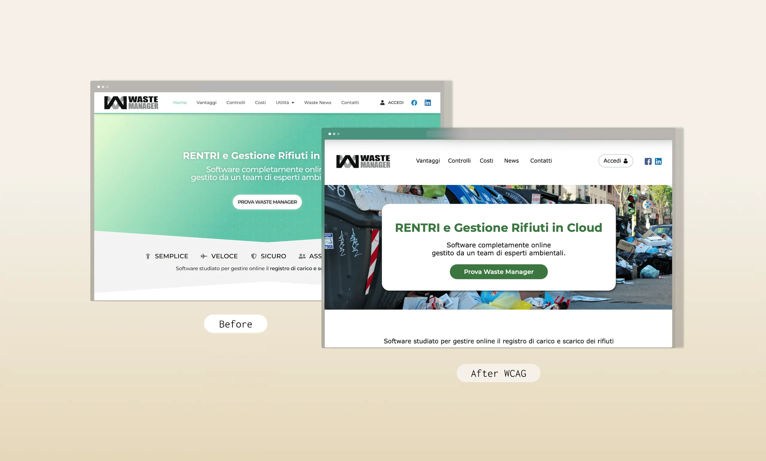
Information architecture simplified from initial proposal through continuous iteration. Wireframes for all main pages and high-fidelity mockups in Figma, followed by interactive prototype for usability testing. WordPress development with Elementor plus VikRestaurants plugin. PageSpeed score improved from 85 → 97 (desktop) and 54 → 72 (mobile). Accessibility: 100/100 on Accessiway.
Artifacts: IA · wireframes · mockups · live WordPress siteCommunication strategy as a design output
The brand strategy needed a go-to-market plan to be complete, not to execute social media, but to define the system that someone else could execute. 4 narrative pillars (spring, garden, family, food) mapped to 3 platforms and 3 personas. A 4+4 day launch campaign structure with defined KPIs. An influencer strategy at 3 levels matching each brand dimension. An email automation flow for post-visit retention. All documented as a handoff-ready framework.
Artifacts: editorial calendar · channel strategy · KPI framework · email flowsKey Decisions — what I chose and what I gave up
The challenge was to make every decision work for three radically different users, stay manageable by a non-technical owner, and preserve the authenticity that 45 years of regulars depended on.
Decision 01 — Two platforms, not one
Separate website (booking/storytelling) and app (takeaway/loyalty)
Website for Lena and Marco: narrative-driven, multilingual, desktop-friendly.
App for Olivia & John: fast ordering, smart pickup, loyalty points.
Each platform optimized for its user.
Why → Research showed three distinct digital behaviors that no single interface could serve well without compromise.
Single all-in-one website with app features
One platform for everything: booking, ordering, loyalty, blog, events.
Why not → Would have created a cognitively overloaded product that served nobody well, and was unmaintainable by a non-technical owner.
Decision 02 — Technology as amplifier, not replacement
QR lockers and smart pickup alongside human service
The smart pickup system frees waitstaff from takeaway logistics so they can focus attention on seated guests. This technology removes friction without removing people.
Why → The case histories of Creator and Robot Restaurant proved automation without warmth fails in hospitality. The lesson from Silo: technology should express values, not substitute them.
Fully automated ordering and tableside tablets
Full digitalization: tablets at tables, QR ordering, contactless end-to-end.
Why not → Would have excluded Marco entirely and destroyed the "warm family restaurant" perception that drives repeat visits and positive reviews.
Decision 03 — WordPress MVP over custom build
WordPress + Elementor + VikRestaurants (free tier)
Proven stack, manageable by a non-technical owner, extensible with paid plugins when revenue justifies it. Full WCAG compliance achievable and multilingual via Polylang.
Why → The system needs to survive without me: a custom build would create dependency and maintenance debt the business couldn't absorb.
Custom React/Next.js frontend
Higher performance, full design control, better mobile experience.
Why not → Requires developer dependency for every content update. For a seasonal restaurant with a non-technical owner, that dependency alone makes the option unworkable.
A brand that tells the "why" before the "what"
Problem
There was no coherent visual identity to build on. The logo alone had gone through three major redesigns since 1983, on top of countless smaller tweaks along the way. Meanwhile the brand's most distinctive assets — the spring, the trout, the olive grove — were invisible in any existing visual communication.
Decision
A new logo combining the trout (the spring's signature product) with an olive branch (the territory of Malcesine) into a single mark. The calligraphic "Da Bianca" lettering (Sheila font) stayed, to keep the feeling of a family's own handwriting. The mark was built responsive in three versions, and the palette was pulled straight from the landscape itself.
Impact
A single glance now communicates the spring, the territory, and the family in one mark. It holds up at 16px (favicon) and on packaging alike. In the same usability test from Solution 02, all 20 participants identified the trout as the restaurant's specialty without being prompted — the mark was doing its job before anyone read a word of copy.
A website built around three different booking intents
Problem
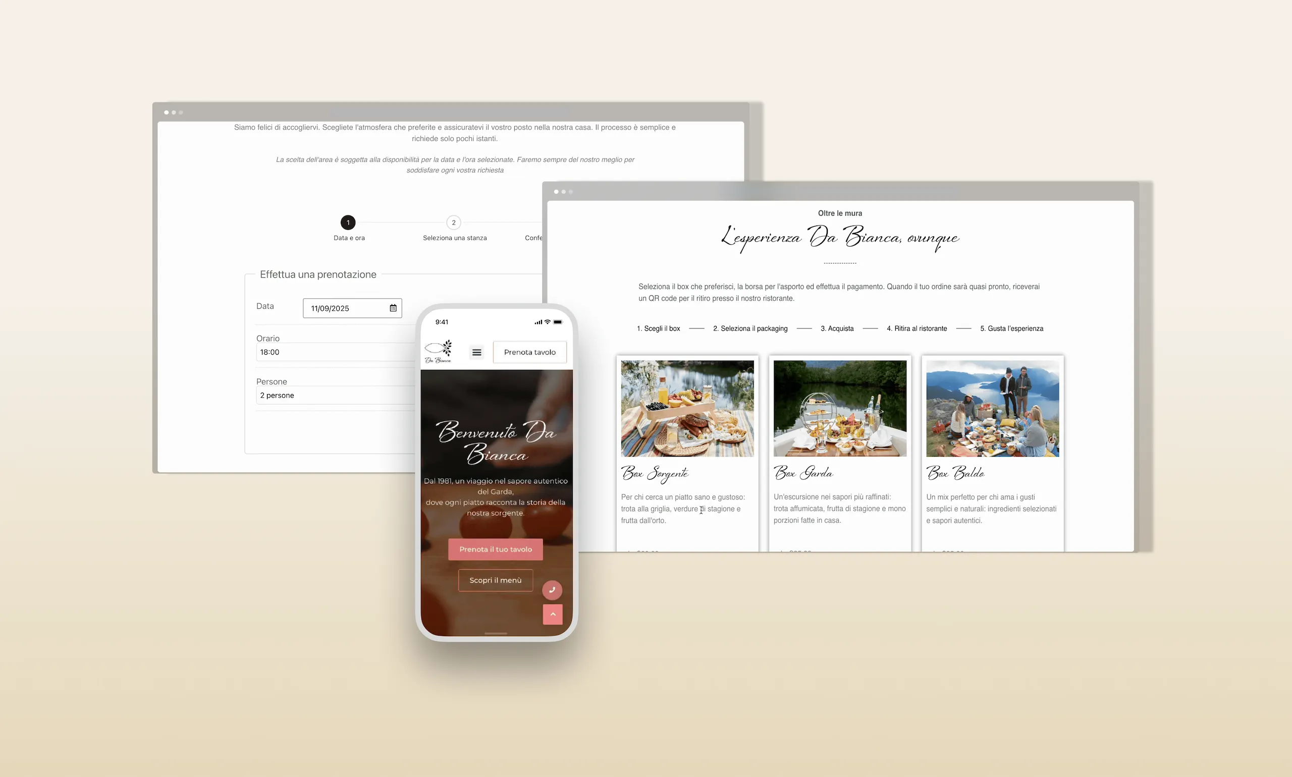
100% of bookings came via phone (messages, calls and emails). No way for Lena to book 2 weeks in advance from Germany; no way for Olivia and John to discover the restaurant before arriving; and Marco was frustrated by digital complexity he didn't need.
Decision
I decided to iterate my first sitemap to a simplified IA: from 12 planned pages to 6 focused ones. Floating phone CTA for mobile users (Marco's path). Online booking via VikRestaurants for Lena's path. Takeaway section with ordering flow for Olivia & John. Multilingual IT/EN/DE. Contrast ratio 8.10:1, WCAG AA throughout.
Impact
100% of 20 usability test participants completed their target task. Navigation rated "clear and intuitive" by all participants. PageSpeed: 97/100 desktop, 72/100 mobile. Accessibility score: 100/100 on Accessiway.
"La Dispensa" — Designing the takeaway experience Malcesine didn't have
Problem
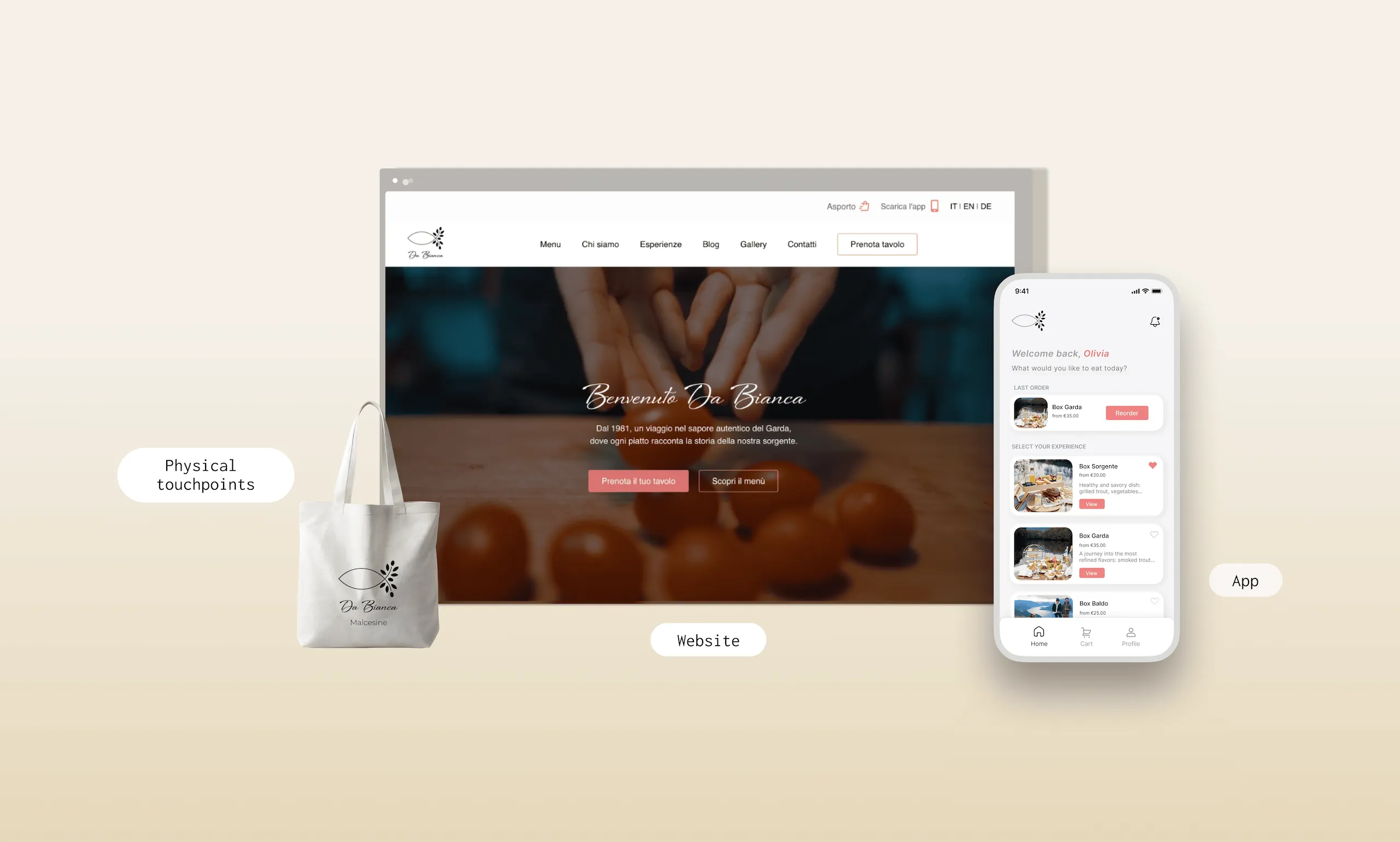
Takeaway existed informally but had no identity, no packaging, and no reason for Olivia & John to prefer it over competitors. Research showed 52.9% of English-speaking respondents preferred takeaway over dining in, but Malcesine has no Deliveroo, no Glovo, no third-party platform to plug into. If Da Bianca wanted that experience, it had to build it.
Decision
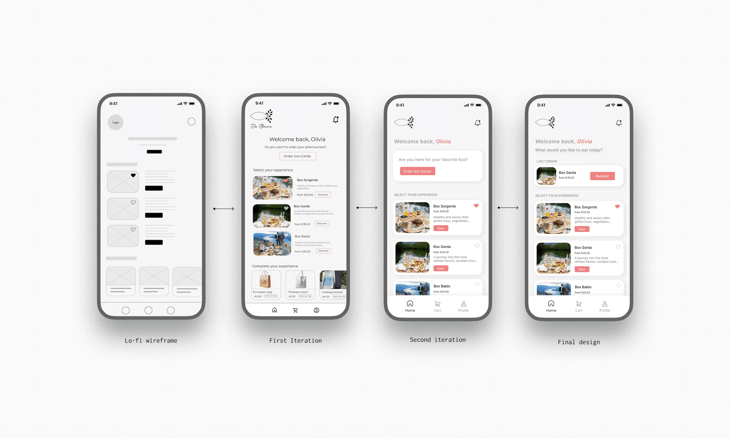
I designed a dedicated app for the takeaway flow, built around how Olivia actually orders: reorder her last box in one tap, browse three options without scrolling through a menu, confirm and go. The physical side (packaging, a reusable tote, a card with a QR code), extends that experience into something she can carry out of the restaurant. Every box that leaves through the app arrives in packaging designed to be reused, not thrown away, following the same zero-waste logic I studied in Silo's case history.
Impact
I designed the core screens and iterated on them through four rounds of feedback, but the build itself was out of scope for this project's timeline. I iterated many times and the home screen went from a generic "order again?" prompt to a dedicated Last Order section with one clear action, while the product cards moved from a vague "Discover" button to a "View" CTA that matches what someone reordering actually wants to do. The tote bag is a small but real piece of that system: a customer who shares a photo of a bag they chose themselves is free advertising that a paid post can't buy.
Impact — what changed and what was validated
This project moved Da Bianca from invisible to discoverable, with a live website, measurable performance, and validated usability, before a single season had passed.
100%
of 20 usability test participants completed their task, navigation rated "clear and intuitive" by all.
97 / 85
PageSpeed score on desktop and mobile, up from 85 and 54.
8.10:1
Contrast ratio across all UI elements, WCAG AA compliant, accessibility score 100/100.
Reflections — what this taught me
The hardest constraint was designing a system sophisticated enough to serve three radically different users, yet simple enough to be run by someone who has never touched a CMS.
- The case histories of failed restaurant technology (Robot Restaurant, Creator, Eatsa) weren't cautionary tales about technology, they were cautionary tales about forgetting who you're designing for. Every decision I made was tested against the question: does this make Marco feel more or less at home?
- A WordPress plugin imposes its own UX logic and UI. The VikRestaurants free tier couldn't match the Figma mockup exactly. I had to rethink part of the design to fit what the tool could actually build, without losing the intent or missing the deadline.
- The project that most needed further development was the app. I defined the concept and designed the key screens, but the actual build was descoped for time. In the next version, I'd prototype the full takeaway flow and test it with Olivia & John-type users before committing to development.